
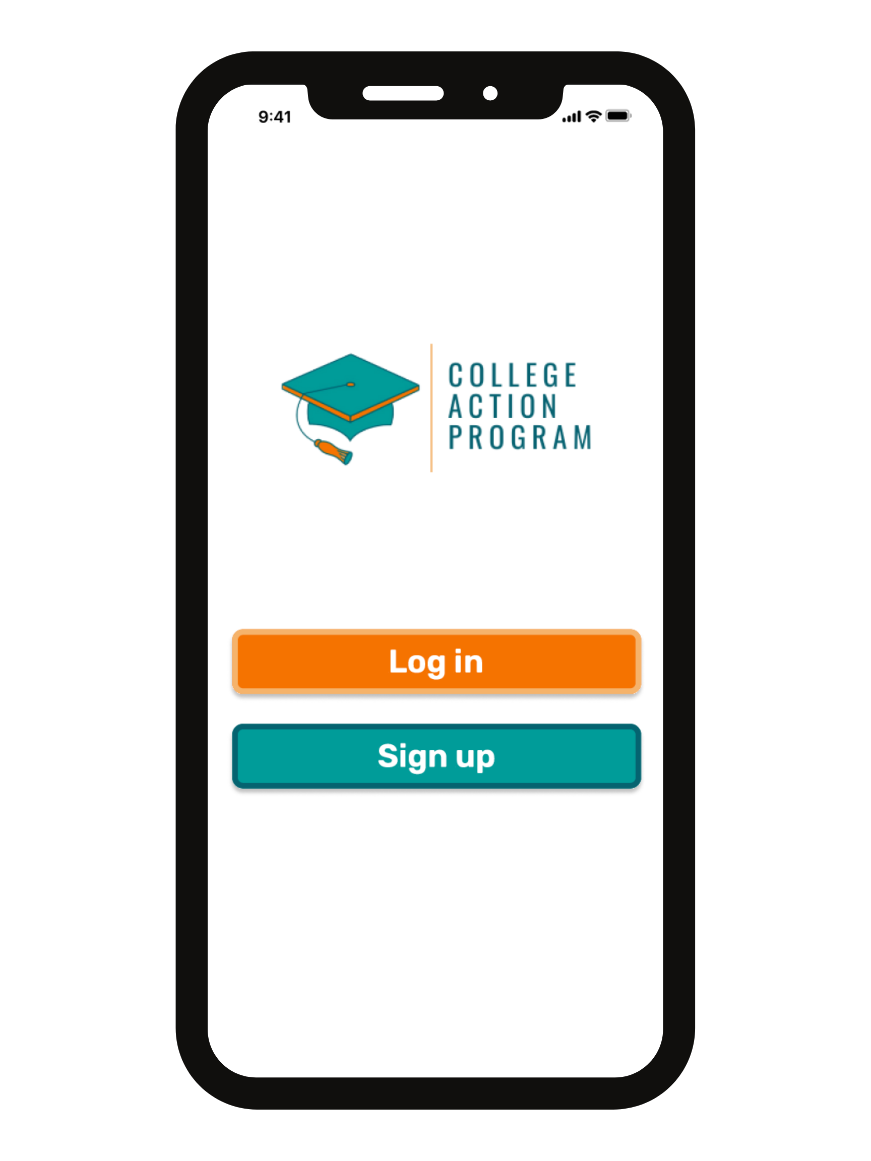
College Action Program
Guiding the future through an unorganized path
Project Synopsis
-
Client
The mission of College Action Program is to support college students from college application to graduation. Historically, we have focused on the college application process – helping students to document and track actionable steps towards college admissions. We are working on expanding our services to incorporate the support of college retention – providing resources and actionable steps to help students throughout their college years, all the way through to graduation.
Owner: Lauren Mills
-
Tools & Methods
Tools:
FIGMA
Otter.ai
Notion
Methods:
User Interviews
Survey
Affinity Map
Journey Map
User Flow
Competitive Analysis
Comparative Analysis
Heuristics Analysis
Plus/Delta Chart
Design System
Wireframing
Prototyping
Usability Testing
-
Team
Israel Casas
Andie Davis
Laura Lopez
-
Role
UX Designer
Design Lead
Project Manager
-
Timeframe
3 Week Sprint
-
Project Type
Client Project
20% of high school students who have been accepted into college do not make it to their first day of class.
The Research
8 Total User Interviews
The main two trends we found in our affinity map were that students often felt there was a lack of information to complete each step, and also found that having guidance and help throughout the process was very beneficial.
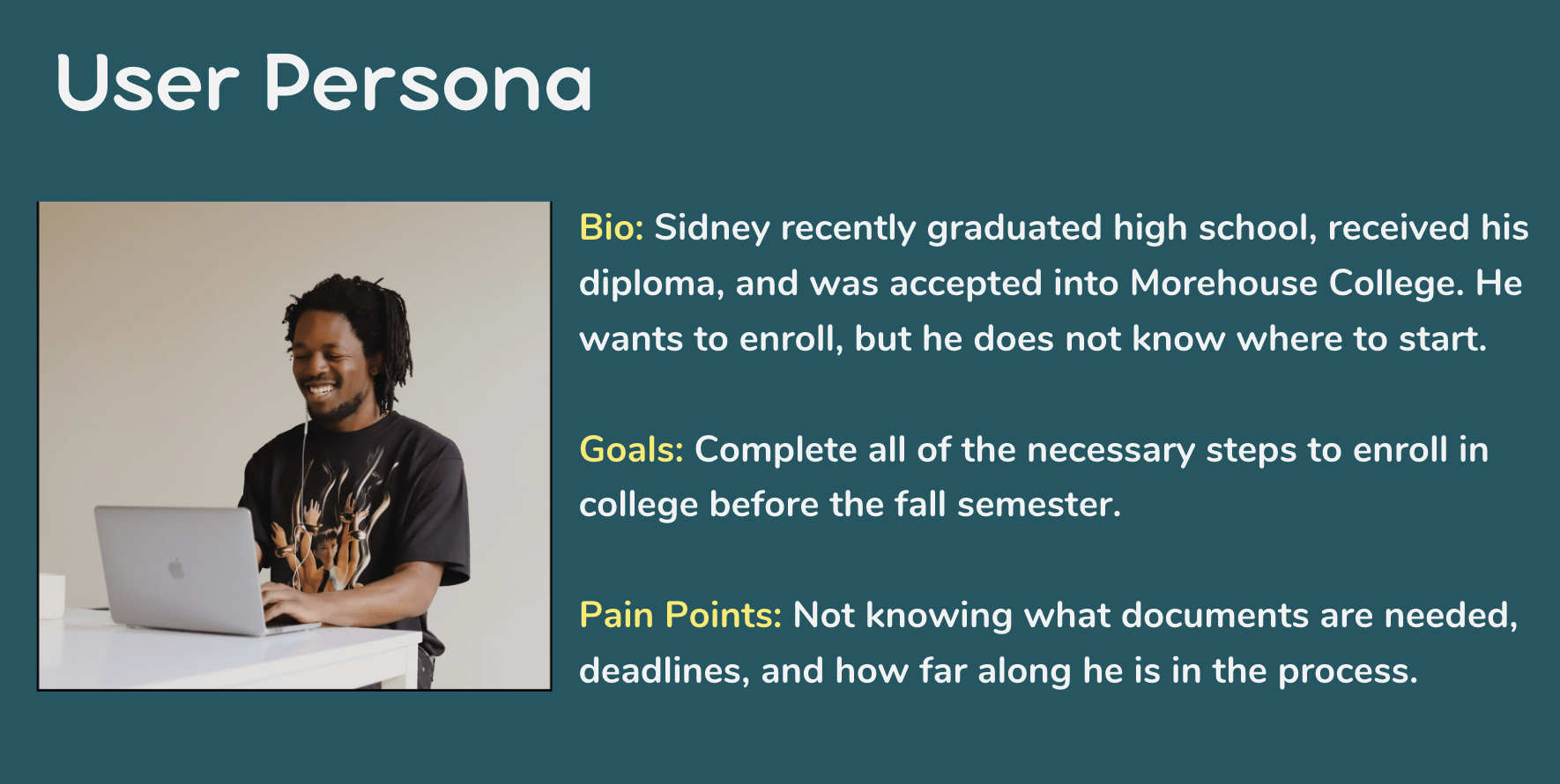
We condensed our users to one persona named Sidney the Student to put a face on our ideal client throughout the process.

According to our surveys and interviews, we found trends that most students struggle with time management and task management, and they need help staying on track.
Out of our 21 students, the majority used a reminders app and a calendar. We implemented all of the tools our users use as well as a progress bar that our client requested.
Students struggled the most with financial aid therefore that will be one flow where we will lesson the friction
The Problem:
Users need guidance and ample information throughout the college enrollment process so that they can have a smooth transition from high school to the first day of college.
The Help the Students Need (Solution):
We believe that if we design a motivational task completion app by applying a visual status of progress, an error prevention system, and accessible resources, then we are likely to see a 10% increase in students who attend college because there are students who do not make it to their first day.
The Design
Design Inspiration: Canvas Student Portal
I chose this design inspiration, so that students will have a familiar format when entering their college career.
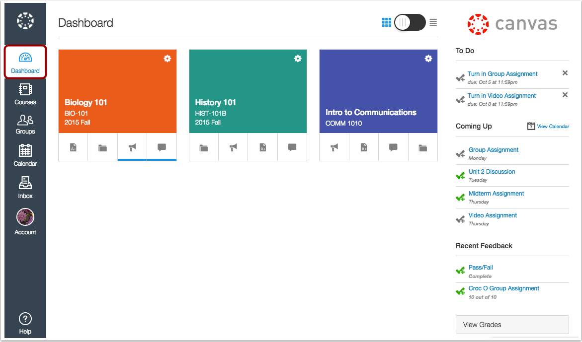
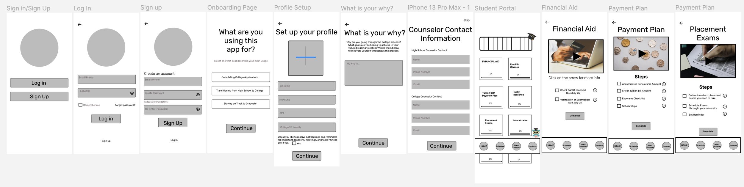
Wireframing our design from onboarding, dashboard, and informational sections.
Dashboard is where the inspiration is implemented.
Progress Bar

A progress bar at the top of the page is included to show overall progress.
The section blocks transition to orange once it is completed.
Informational Steps

Each section has an informational video and steps needed in order to complete each section.
The mentor button is used when a user needs assistance.
Ample Information

Each step has ample information on how to complete a section of the enrollment process.
Help & Guidance

An online mentor is there for assistance if a user is having trouble understanding the informational video or steps.
Agenda
Calendar & Reminders

We included the calendar feature because that is the tool our users used the most.
Once an event is set on the calendar…. the app will send off a notification as a reminder that it is approaching.
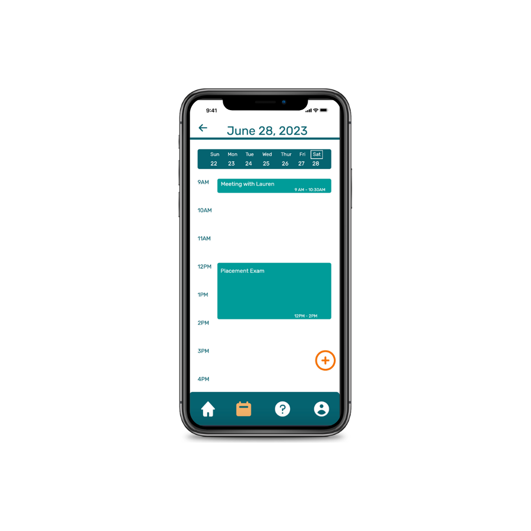
Each event can be shown on the agenda as well.
Finals Week! Testing Results
-

Additional Feature
Create a functional “Plus” button so that the user can add expenses/scholarships onto their lists on the app.
-

Universal Icons
Gather more data to decide whether to use an "i" symbol or an arrow on each information step. We want to let the user know that if they press this redirection symbol it will take them to more information.
-

Automation Tasks
Once a section is completed, automate the “Check” symbol on the checkbox so that there is no unnecessary user interaction (back and forth clicking).